Pottery decorating at Emma Bridgewater
As 2019 drew to a close, I went on a day trip to the Emma Bridgewater factory with my mother-in-law and a few of her friends to attend one of their pottery decorating workshops. Although I had previously tried painting pottery on a hen party many years ago and I was abysmal at it, I was excited to try it again. There is something freeing about being a beginner and just giving something a go. We arrived a little ahead of time and warmed up with a cup of tea in their café, taking inspiration from the various cups, teapots, and plates on show. I had no idea what I was going to make but knew that I wanted whatever I came home with to be something that we would use.

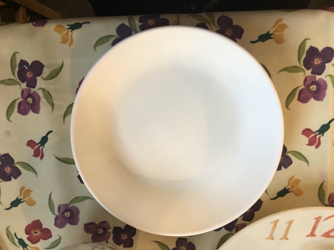
The decorating studio is a large space with tables for many parties, mostly seating six per station. When you arrive you're directed to a rack of premade items where you select what you want to paint during the 90 minute session - you can take one or more if you're feeling confident you'll get through more in the time. There is a range of items on offer varying from bowls to teapots to mugs. If you're on a budget be sure to look at the prices - they vary widely from about £7 to £46. I opted for a mid range pasta bowl knowing that it could double up as a serving dish when we have friends or family over for dinner. However this piece turned out, it would be much prettier than the cooking dishes I normally end up using!

Once you've selected your items you head to your allocated table. Everything you need is supplied - a palette to get the paint, paintbrushes, pencils, an eraser for mistakes (this is like pure magic), aprons, and bowls for water. For those who are not confident in their sketching ability, you can use pre-cut sponges. Before diving in to designing and painting, you get a quick overview of the paints and how to use the sponges. Perhaps the most useful part of this demo is the large plate they bring to show you how the Emma Bridgewater colour wheel and how each colour looks once it has been glazed and fired. As many of the finished colours are very different to their original state, it was helpful to see how they worked together for the finished piece.

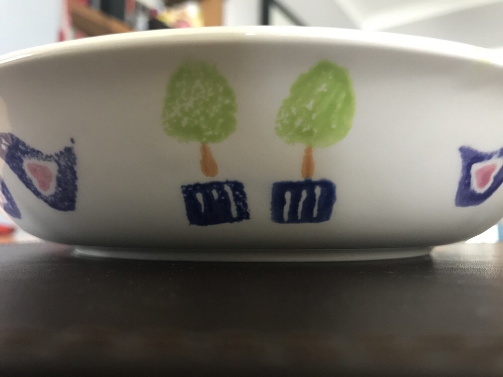
Not being known for my sketching skills (although I'm trying to find time to work on this) and having even less confidence in my painting ability, I chose the safety of the pre-cut sponges. There are many different designs to choose from and you can see some of them in the example finished pieces in the studio. I originally opted for a pair of wellington boots and polka dots but quickly changed my mind when I discovered the boots were too tall for the side of the bowl. I didn't like the idea of placing them in the centre of the dish. Heading back to the rack, I spotted a couple of containers that had various bird and tree options and, importantly, were small in size. I decided to alternate a pair of love birds with a tree growing in a pot on the outside of the bowl. To ensure even spacing of the birds and trees I should have roughly marked where each would go. Obviously I didn't do this and ended up with two very obvious gaps which I filled with a pair of trees. Now having the finished bowl, I wish I had paired the trees all the way round as it feels more balanced with the birds.
Achieving an even finish with the sponges was a little tricky. In part this is because a number of the sponges are very well worn with small chunks missing. This doesn't seem like a big deal until you press the sponge to your item and you're left with a gaping hole in the design. Additionally, you don't always apply the same amount of paint to the sponge each time or use the same amount of pressure or speed when removing the sponge. Thankfully the magic erasure (I think it is just fine sandpaper) helped remove any major mistakes. It is tempting to keep removing items until the prints are perfect but eventually you have to opt for better done and fairly even than perfect.
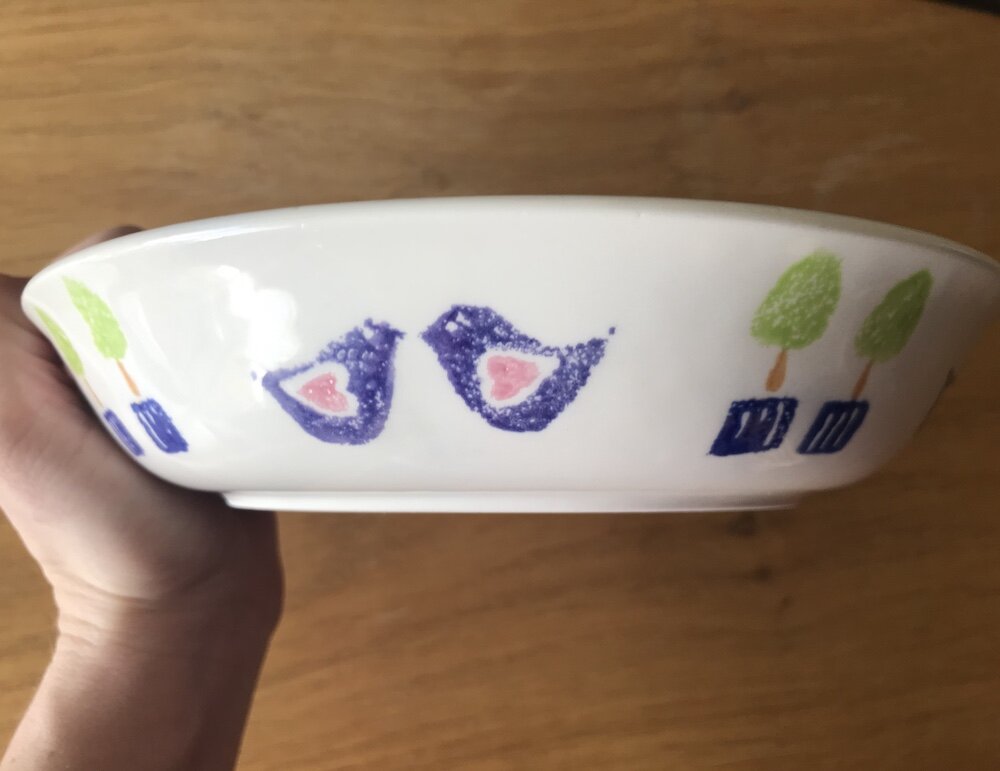
I had an easier time selecting the colours, knowing I wanted something bright and vibrant. Having seen how the colours are after firing, I chose a couple of lighter colours to balance out the darker blue and purple. I'm really pleased with how they work together. With some time left, I turned my attention to the inside of the bowl. It seemed too large a space to leave blank when we can't really see the side of the bowl when it is on the table. I went back to my original idea of polka dots and placed them randomly. I didn't want the inside to be as vibrant as the outside as I was worried it would be too much so opted for slightly more subtle colours. For continuity, I used the same pink as in the love birds pairing it with a light grey and turquoise.
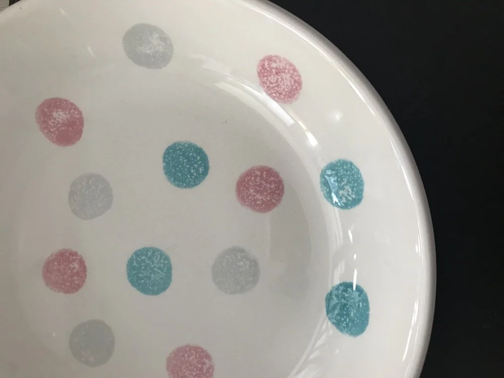
At the end of the workshop, you hand back your items for glazing and firing which generally takes around two weeks although we were warned it would be longer with the Christmas closure of the factory. I was amazed to receive my piece in the post two and half weeks later. I'm thrilled with how it came out. I'm particularly pleased with the polka dots - the colour combination makes me smile. I'd recommend a visit to the decorating studio if you're in the area. It was a fun way to spend a few hours and the place had a friendly and warm creative atmosphere. It was very interesting to note the change in many individuals who were very unsure of their creative ability at the beginning but were buzzing at the end purely for just having made something.